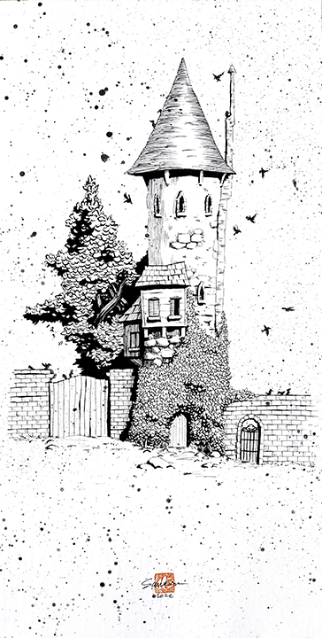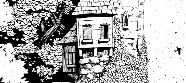
I’ve always loved good pen and ink illustration, so I’m starting to refine my own technique. I hope that I’ll be able to build up a consistent style and process that captures what I love the most from the variety of accomplished pen and ink illustrators that I love so much. The first illustration I decided to take a stab at was a fantasy tower setting from a game supplement I’m writing. Having the maps and an understanding of the look and feel, I pulled a ton of reference images, and not just of tower photography but also of pen and ink styles I admire. Then I did some sketching.
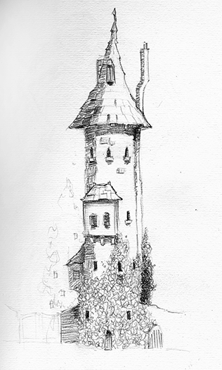
Once the preliminary sketch was complete, I set out to figure out just how detailed I wanted to go with the ink. The styles of pen and ink that I enjoy range greatly from loose, gestural-type work to much more refined and detailed. I like hatching but also appreciate heavy, deep shadow areas that remind me of the chiaroscuro style of painting and the film noir movies that I loved from an early age. I use Microns and Pitt pens, and Tombows for brush-type work and solid shadow areas. I completed my test inking on sketch paper.
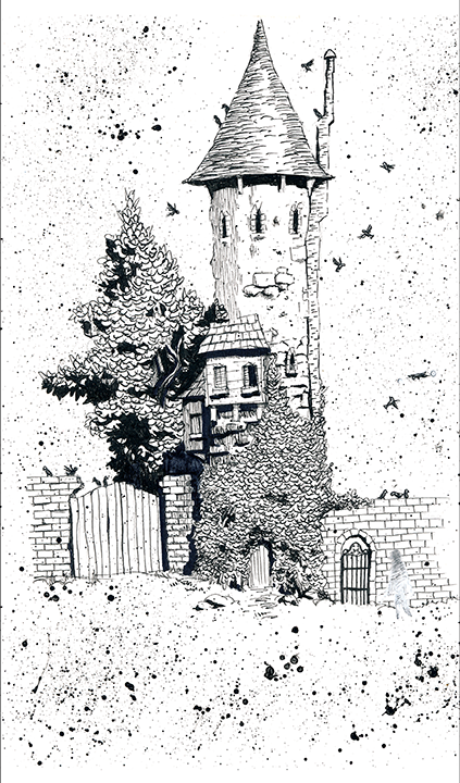
For the final illustration, I gridded out the composition and created the final on cold-press illustration board. I also chose to incorporate a frenetic, textural approach I have seen in digital art I like. After finishing the pen and ink work, I summon up as much courage as I can and then make a loose slurry of black acrylic paint, load it up on an old fan brush, and flick it over the composition.