All posts by msanborn

Even More Fear Cards for Ghost Estate

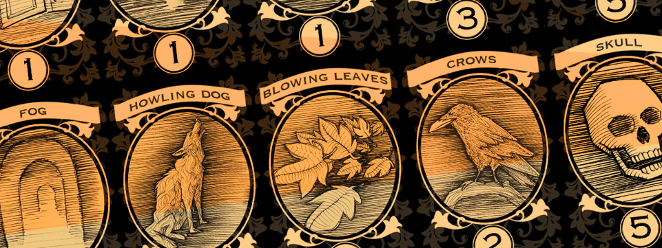
Some of my favorite spooky things are in this group of Fear Card illustrations. I’m particularly fond of the Creepy Doll, the Old Portrait, and the Stone Idol. I thought those turned out particularly well. The Stone Idol, of course, being a shout out to “The Exorcist” and the Creepy Doll being for my daughter. She very much wants to see the movie “Annabelle.” I think 9 years old is a little early for that one. I actually preferred the opening to “The Conjuring” as that scared me more than the whole of “Annabelle.”

These illustrations I also completed with the dark blue Colorase pencil on sketch paper. The red Colorase pencil isn’t bad and the black works as well as graphite. I would definitely steer clear of the light blue Colorase pencil, though. It might be okay for animation but for concept work you can’t get a good enough range in the values.

MANSION_Cards_Print_003_2018_04_01

Fear Cards for Ghost Estate

Once the illustrations for the ghosts were complete, I set to the task of thinking up and illustrating every creepy thing you might expect to find in a haunted house. My daughter, Ruby, was a huge help. She and her friends pretend to be ghost hunters at their elementary school and tell each other creepy stories. She had a lot of ideas of what should be in her game. The idea behind this part of the game is that you find scary things when searching rooms and they add to your overall fear. You hold up to a total of three cards, replacing lesser cards with higher point cards, until you miss a fear roll and run out of the house. Once outside, you can remove cards at 1 per round, until you are ready to re-enter the house. Pretty scary, huh?

These I sketched with my blue Colerase pencil on sketch paper and then used a lightbox to ink them on clean sheets of paper. I like using the dark blue Colorase pencil as it holds up better in sketchbooks than graphite while still retaining some erasability. You definitely get less smudging than with graphite. For the inking, I use Micron pens with tips varying from 05 to 005. I like the heavier contour lines and the lighter, thinner lines for the cross contour and hatching.

MANSION_Cards_Print_001_2018_04_01

Card Illustrations for Ghost Estate

I’ve completed a number of ghost illustrations for the Ghost Estate boardgame I’m working on for my daughter. The idea behind the game is to move through a haunted estate, encountering spooky elements and fighting to keep your calm and continue exploring the house. If you fail a fear roll, you run out of the house until you can compose yourself and return. Eventually, one of the players will encounter one or more ghosts and then play continues until someone can defeat the ghost and win the game. In order to make the ghosts a little less scary, I enlarged their heads to give them a more characatured appearance. The game is designed for little kids, after all. I expect the age range would be somewhere between 8-18. I started with sketches then inked over them on a light box with micron pens, defining what I could of their forms through cross -contour line and trying for some dramatic and creepy lighting. Once the inks were done, I brought them into Photoshop and added in a little ghostly feel with some hazy white glow and bright green color. After printing the cards, I really had to pump up the green to get it as bright as I wanted.

MANSION_ghosts_2018_02_06 MANSION_ghosts_inks2018_02_06 MANSION_Cards_Print_2018_04_01


New Deer Painting Completed

I’m kicking myself as I wasn’t able to get this piece done in time to get it to my father for his birthday. I didn’t push hard ehoughand ended up succumbing to sickness near the end. That and my day job has been kicking my rear with class revisions and the like. I did get the piece done, regardless. I just hope dad doesn’t mind getting it a little late.

This one proved to be a challenge. The canvas I worked on had parts where the gesso resisted the charcoal. I was able to build out what I needed in black and white colored pencil after sprayfixing the charcoal. The reference I used was mostly black and white with lighting directly overhead so I had to work up the color and more angled lighting from my brain. I’m not a huge fan of winging things like that. Still, I think I was able to piece it together well enough. I still have to address the canvas sides and maybe push in a few details on the headress. Still I’m ready to call it done.

ANIMAL_deer_painting_150_2018_05_11

Digitally Painted Game Board

I finally managed to grab a minute to post about my digital, plussed-up version of the ghost boardgame board that I made for my daughter. I took a little inspiration from the Downton Abbey boardgame board when I was mocking this up. The only difference is that instead of running from room to room serving the tea and laundering the sheets and whatever else Mister Carson decides you need to do, you are fighting down your fear and hunting ghosts. Personally, I’d take the horrors of the undead before the cascade of never-ending chores in that massive house.

As much as my wife tells me the look is dated, I still like to use ornamentation in some of my projects. When I was mocking up the blueprint for the initial pen and ink map of the house, I threw together some preliminary lighting in Photoshop. Luckily, when I found I needed to push the pen and ink a little further, I was able to bring that forward and make the lighting pop a little more. I found it gave the work a little more of that gloomy feel that I was going for. The colored stairs tell the player where pawns move from one floor to the next. For the overall color scheme, I wanted a sepia-toned old map type feel. I had a lot of fun with the lighting and shadows, making them all consistent, either with the light from the moon coming in the windows or with the individual lights in the rooms. When I got to merge the two light sources together, I found that to be even more interesting and fun to bring together.

MANSION_boardPrint_blogImage_2018_05_01

Birthday Dinosaurs

Apparently I was a liar when I said I wasn’t going to let anything else derail my attempts to get Miranda’s book done. While I did complete another really great thumbnail panel (the angle is sweet!) the other day, I let my wife talk me into making a bunch of dinosaur illustrations for Miranda’s birthday party. I remember creating a bunch of birthday monsters for Ruby when she was Miranda’s age so now I guess I’m on point again. So here are the five illustrations I came up with. I pulled out one of Ruby’s books about dinosaurs for reference, though mine are very loosely based on the real things. They came together pretty quick, a few hours, from pencil to inks. I do enjoy any time I get to play and be creative with my line quality so it wasn’t hard to talk me into the project. I also was able to get another thumbnail done for the book as well and another video demo for my teaching job. Just run run run from pre-dawn to post-dusk.

DINO_all_small_2018_04_11

New Boardgame Design Underway

In a weak moment I decided I would start working on a haunted house boardgame for my daughter who is turning 9. She loves all things creepy and likes playing boardgames so I just couldn’t resist. I call it a weak moment as it means I will need to take a little break again from working on the children’s book for my other daughter. This will be the last self-imposed break from that work. I swear.

The idea behind the game is that players explore a haunted house, fighting their fear all the way through. As they move from room to room, they encounter things that add to their overall fear and find objects that help them in their quest to discover and overcome one of the many ghosts in the house. I started working on the board in Photoshop, mocking up blueprints. I worked to scale so that I could make sure the spaces for the board would actually be correctly sized once I complete the board and print it on a 20 inch by 20 inch square.

Once I completed the Photoshop mock-up, I printed out on 8 1/2 x 11, letter-sized pages, taped them together and then used my light table to ink the plans onto cold-press Arches watercolor paper. I’m trying to use a hatched style in all the illustrations for consistency, including in the board. Defining the lighting in each room and the hallways proved to be a challenge.

MANSION_ink_board_small_001_2018_04_05


Miranda and the Men from Mars panels 9-12

Here are the next four panels for Miranda and the Men from Mars. Funny how my thumbnails get increasingly more and more refined the more I work into the book. By the time I’m done working up the thumbnails I expect they’ll probably be semi-polished illustrations. I anticipate some real challenges painting panel 10, what with the holographic display. I might have to do a test before approaching that one.

Miranda_thumbnail_panels_09_small_2017_12_01 Miranda_thumbnail_panels_10_small_2017_12_01 Miranda_thumbnail_panels_11_small_2017_12_01 Miranda_thumbnail_panels_12_small_2017_12_01

Miranda and the Men from Mars panels 5-8

Here are the next four panels of Miranda’s book. This project is taking a lot out of me. My guess would be that it is due to the added pressure I’ve given myself to set up a really solid foundation to build on. Last thing I want is to not have spent enough time exploring different compositions and angles and then end up working on compositions for months that are not all that engaging to me.

In these panels, Miranda helps Bob as much as she can and the both of them travel to Mars, landing in a old parts storeroom. In some of the panels you can see faint indications of my center line where the page would fold and where I have lightly blocked in rule of third lines. It is sometimes challenging to maintain space for the fold in the center of the page and stay true to my rule of thirds.

On a half related note, I am taking a small break from nthe book while I design a ghost hunter game for my elder daughter. Naturally, I will post that artwork as I start making progress on that as well.

Miranda_thumbnail_panels_005_small_2017_12_01 Miranda_thumbnail_panels_006_small_2017_12_01 Miranda_thumbnail_panels_007_small_2017_12_01 Miranda_thumbnail_panels_008_small_2017_12_01

Miranda and the Men from Mars panels 1-4

I’ve started laying out the thumbnail panels for my latest children’s book, Miranda and the Men from Mars. Since my last children’s book, I’ve made realizations on things I could have done better or more efficiently. One of these is to spend more time on the pre-production work, setting up character sheets, drawing out environments, refining the written material until I get dizzy, and, of course, spend more time getting stronger and more interesting compositions for my thumbnail panels. The compositions I came up with for my last book weren’t bad, I just felt some could have used more interesting angles. My favorite panel from the last book involved an over the head shot so I am striving to get to that happy place more in this new book.

Here are the first four panels in which Miranda argues with her sister, is awakened by noise from outside, and discovers a damaged Martian robot named BOB. You might notice the large white areas that have been erased in each panel. Once I’ve completed the initial thumbnail, I insert it into InDesign and place the text. Sometimes I need to move things around or erase more area to accomodate the writing. This is one of the most challenging parts of the process. Once the foundation is in there, I find it much easier to hammer away at the refinement of the details.

Miranda_thumbnail_panels_001_small_2017_12_01 Miranda_thumbnail_panels_002_small_2017_12_01 Miranda_thumbnail_panels_003_small_2017_12_01 Miranda_thumbnail_panels_004_small_2017_12_01