Category Archives: Blog

Large Mongoose Painting

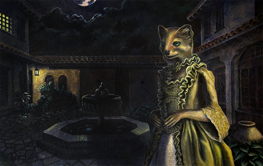
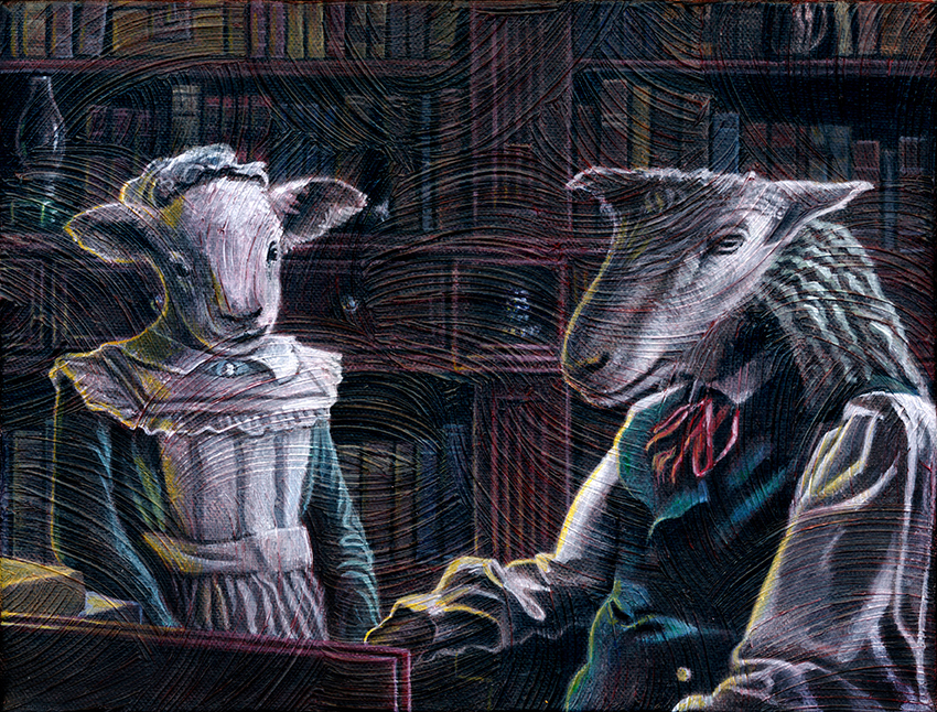
After completing the charcoal base values, which took about 2 weeks in total, I was then able to proceed with the painting portion of the work. Once the values had been liberally sealed so they wouldn’t smudge, I applied a heavy gel medium over the whole canvas with what I like to refer to as my “magic brush.” Gel medium is a thick paste like paint medium lacking pigment. It gives great texture and dries clear showing the value underneath. My magic brush is just a simple flat 1 inch painter’s brush that I have used to apply gel medium for years. At this point, the brush is so caked with hardened gel medium, it is now really just about 50 thick, spike-like collections of bristle groups that I can use to get the pronounced swirls in the gel medium covering my canvas. I have occasionally applied the gel medium to reinforce aspects of the subject matter but more often I apply a simple, overlapping swirl pattern to keep a consistent look between my works.

Once the gel medium has been applied and has dried, I lay in my base shadow colors with an acrylic wash of pretty watery paint. After that is done, I acrylic wash in my base colors. I will usually do this stage with the canvas flat so the paint doesn’t run and just pools into the valleys in my swirling texture. Moving forward, I hand mix my paints to layer in complexity and nuance into the painting color work. Once completed, the painting is almost done. I will often push in the shadows darker and layer in lighter illuminated areas and highlights. In a final pass, I will dry-brush areas to help reinforce the heavy texture, brushing in lighter values across the peaks of the gel medium texture.

Large Mongoose Charcoals

Yes. I have returned to blogging on my website. This is something I’ve been meaning to do for a while. I’m still pretty disillusioned with social media so I haven’t decided if I’ll push this to any of those sites. After getting my website back up, I realized I missed talking about my process. So this is going to be more for my kids and I and whomever wants to check in and hear me ramble about my art process. So enough about that.

Here is my charcoal pass for the Large mongoose painting I am titling Courtyard at Moonlight. This painting shows Isabella De La Rosa as seen by William Weatherford. I started with a Photoshop mock-up where I cobbled together what photo references I could, applied a grid overlay to the image, and then transferred the grid lines to my toned canvas. For any of you who have not heard the term before, toning is where you apply a light to middle value of evenly to the whole canvas.

Once the grid has been lightly erased into the toned canvas, I blocked in the forms and then started laying in my values paying close attention to the shapes and lines in each square of the grid. Focusing on line and shape in each grid square helps to view the subject matter more objectively and accurately, assisting with the maintaining of good scale and proportion. Once the values were laid in, I went in and refined in details using charcoal pencils, kneaded erasers, and a folded paper towel for blending small areas and working in the charcoal. The folded rough paper towel is one of my favorite drawing tools. It is cheap and you can fold and re-fold sharp corners in it allowing you to blend in and manipulate tighter details in your charcoal.

After finishing the charcoal, I applied spray fixative liberally (so liberally that it pooled up on the surface in places) to seal the charcoal layer. Final touches to details were applied with black and white colored pencils and I used the white colored pencil to pull out brighter light areas as the spray fixative darkens all the charcoals.

Completed Holiday Card for 2019

I finished the holiday card painting for 2019. The bookshelf took some time but was more enjoyable than I had anticipated. Once I finished it, however, it was competing a little too much with the characters so I pushed it back with a black wash. The story was fun to write as well. I had to sit there in front of the painting for a time before the characters started to speak to me. The old sheep felt so tired to me that I couldn’t avoid that coming out in the story.

ANIMAL_sheep_painted_72_2019_11_22

New Holiday Card for 2019

Finally getting around to posting again. Been a while. I’m gonna keep these short and sweet from now on to make the posting seem less daunting. Here are the finished charcoals for this year’s holiday card. The base is charcoal which was then sealed with about 7 lbs of fixative. Seriously, the thing was swimming in it. I was a little worried as it started cloudy but, as always, it dried clear. Then I went in with white colored pencil and popped out some of the highlights and ushed back in a little more light into areas. Everything goes pretty dark after the fixative.

ANIMAL_sheep_charcoal_coloredPencil_72_2019_11_15

Even More Fear Cards for Ghost Estate

Some of my favorite spooky things are in this group of Fear Card illustrations. I’m particularly fond of the Creepy Doll, the Old Portrait, and the Stone Idol. I thought those turned out particularly well. The Stone Idol, of course, being a shout out to “The Exorcist” and the Creepy Doll being for my daughter. She very much wants to see the movie “Annabelle.” I think 9 years old is a little early for that one. I actually preferred the opening to “The Conjuring” as that scared me more than the whole of “Annabelle.”

These illustrations I also completed with the dark blue Colorase pencil on sketch paper. The red Colorase pencil isn’t bad and the black works as well as graphite. I would definitely steer clear of the light blue Colorase pencil, though. It might be okay for animation but for concept work you can’t get a good enough range in the values.

MANSION_Cards_Print_003_2018_04_01

Fear Cards for Ghost Estate

Once the illustrations for the ghosts were complete, I set to the task of thinking up and illustrating every creepy thing you might expect to find in a haunted house. My daughter, Ruby, was a huge help. She and her friends pretend to be ghost hunters at their elementary school and tell each other creepy stories. She had a lot of ideas of what should be in her game. The idea behind this part of the game is that you find scary things when searching rooms and they add to your overall fear. You hold up to a total of three cards, replacing lesser cards with higher point cards, until you miss a fear roll and run out of the house. Once outside, you can remove cards at 1 per round, until you are ready to re-enter the house. Pretty scary, huh?

These I sketched with my blue Colerase pencil on sketch paper and then used a lightbox to ink them on clean sheets of paper. I like using the dark blue Colorase pencil as it holds up better in sketchbooks than graphite while still retaining some erasability. You definitely get less smudging than with graphite. For the inking, I use Micron pens with tips varying from 05 to 005. I like the heavier contour lines and the lighter, thinner lines for the cross contour and hatching.

MANSION_Cards_Print_001_2018_04_01

Card Illustrations for Ghost Estate

I’ve completed a number of ghost illustrations for the Ghost Estate boardgame I’m working on for my daughter. The idea behind the game is to move through a haunted estate, encountering spooky elements and fighting to keep your calm and continue exploring the house. If you fail a fear roll, you run out of the house until you can compose yourself and return. Eventually, one of the players will encounter one or more ghosts and then play continues until someone can defeat the ghost and win the game. In order to make the ghosts a little less scary, I enlarged their heads to give them a more characatured appearance. The game is designed for little kids, after all. I expect the age range would be somewhere between 8-18. I started with sketches then inked over them on a light box with micron pens, defining what I could of their forms through cross -contour line and trying for some dramatic and creepy lighting. Once the inks were done, I brought them into Photoshop and added in a little ghostly feel with some hazy white glow and bright green color. After printing the cards, I really had to pump up the green to get it as bright as I wanted.

MANSION_ghosts_2018_02_06 MANSION_ghosts_inks2018_02_06 MANSION_Cards_Print_2018_04_01


New Deer Painting Completed

I’m kicking myself as I wasn’t able to get this piece done in time to get it to my father for his birthday. I didn’t push hard ehoughand ended up succumbing to sickness near the end. That and my day job has been kicking my rear with class revisions and the like. I did get the piece done, regardless. I just hope dad doesn’t mind getting it a little late.

This one proved to be a challenge. The canvas I worked on had parts where the gesso resisted the charcoal. I was able to build out what I needed in black and white colored pencil after sprayfixing the charcoal. The reference I used was mostly black and white with lighting directly overhead so I had to work up the color and more angled lighting from my brain. I’m not a huge fan of winging things like that. Still, I think I was able to piece it together well enough. I still have to address the canvas sides and maybe push in a few details on the headress. Still I’m ready to call it done.

ANIMAL_deer_painting_150_2018_05_11

Digitally Painted Game Board

I finally managed to grab a minute to post about my digital, plussed-up version of the ghost boardgame board that I made for my daughter. I took a little inspiration from the Downton Abbey boardgame board when I was mocking this up. The only difference is that instead of running from room to room serving the tea and laundering the sheets and whatever else Mister Carson decides you need to do, you are fighting down your fear and hunting ghosts. Personally, I’d take the horrors of the undead before the cascade of never-ending chores in that massive house.

As much as my wife tells me the look is dated, I still like to use ornamentation in some of my projects. When I was mocking up the blueprint for the initial pen and ink map of the house, I threw together some preliminary lighting in Photoshop. Luckily, when I found I needed to push the pen and ink a little further, I was able to bring that forward and make the lighting pop a little more. I found it gave the work a little more of that gloomy feel that I was going for. The colored stairs tell the player where pawns move from one floor to the next. For the overall color scheme, I wanted a sepia-toned old map type feel. I had a lot of fun with the lighting and shadows, making them all consistent, either with the light from the moon coming in the windows or with the individual lights in the rooms. When I got to merge the two light sources together, I found that to be even more interesting and fun to bring together.

MANSION_boardPrint_blogImage_2018_05_01

Birthday Dinosaurs

Apparently I was a liar when I said I wasn’t going to let anything else derail my attempts to get Miranda’s book done. While I did complete another really great thumbnail panel (the angle is sweet!) the other day, I let my wife talk me into making a bunch of dinosaur illustrations for Miranda’s birthday party. I remember creating a bunch of birthday monsters for Ruby when she was Miranda’s age so now I guess I’m on point again. So here are the five illustrations I came up with. I pulled out one of Ruby’s books about dinosaurs for reference, though mine are very loosely based on the real things. They came together pretty quick, a few hours, from pencil to inks. I do enjoy any time I get to play and be creative with my line quality so it wasn’t hard to talk me into the project. I also was able to get another thumbnail done for the book as well and another video demo for my teaching job. Just run run run from pre-dawn to post-dusk.

DINO_all_small_2018_04_11